Classic Shades Painting
Great looking, long-lasting paint job. Guaranteed !℠
Do You Have A Painting Project We Can Help With?
More About Paint Color – The Color Wheel
Time and time again I see people struggling with color. Indeed, color selection can become the most difficult part of the house painting process. I have seen people’s eyes literally glaze over with bewilderment when faced with a color making decision. Sometimes, people struggle for months, looking at paint swatches, putting up paint samples, talking to relatives, and still not be able to decide.
Perhaps you too have seen homes covered with dozens of paint samples. Well, take my word for it, there are a lot more of these samples at home interiors. And just the other day I have seen some paint sampling that, by the homeowner’s admission, have been there for years.
So, why should so many people have such a hard time with color? Personally, I think it has a lot to do with confusion about basic color terms and the lack of familiarity with basic color tools.
Color harmony is a very common color term used to describe certain color combinations that appear pleasing. Colors that do not appear to agree with each other, or that clash, are not in harmony. Developed through experience, there are some easy rules that can help us to come up with harmonious color selections. Most of these rules involve the use of the color wheel. But before we get started with practical application of the color wheel, we must first define some basic color terms and perhaps clear up some prior confusion on the subject of color in the process.
A common source of confusion with color are words “tint,” “shade” and “tone.” People in general, and sometimes even those dealing with color professionally, use these words very loosely to describe any variation of color.
Colors like pure red or green are rarely used in the creating a color scheme. Black, white or gray paint can be added to any pure color paint in order to change its characteristic in a specific way. The words “tint,” “shade” and “tone” are technical terms that describe each particular kind of change.
Tint – A color that has been lightened by adding white. For example, adding white to red makes pink. Thus you may say that pink is a tint of red. The word “tint” is often used also to describe the action of adding any colorant to the paint base. This use of the word “tint” would be correct, with regards to our technical definition, if we were mixing a color with the white paint base. The thing is – not all of the paint bases are white, and this can make such use of this word a bit misleading. Don’t get me wrong, I am not knocking the popular definition of “tint”, I am just pointing out the difference between the popular definition and the technical definition, which is the one that we will be using here in talking about decorating with color.

Shade – A color that has been darkened by addition of black. For example, adding black to green makes a shade of green, such as forest green. Brown is really just a deep shade of orange. Navy is a shade of blue, which is made by adding black to blue. However, people will often use the word “shade” to mean any color variation. They will ask for a lighter shade of yellow, when what they are really looking for is a tint (yellow diluted by white).

Tone – A color with some gray added. Adding gray will result in the color being muted, or toned down, without making it too much lighter or darker. We can gray out a color to a point where only a tiny hint of it remains. I have heard people say that they want a green with a tint of gray and then be pointing to a toned down green.

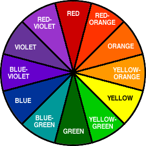
The Color Wheel is a simple tool that can help us think about color. It is also one of the most powerful tools available for home decorating. The color wheel is basically a circle of colors represented in the color spectrum. A typical color wheel is made up of 12 colors. Learn how these 12 combine and you will be able to create many great looking color schemes.

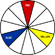
Three Primary Colors – Red, Blue and Yellow. Every other color is made up of some combination of these three. Primary colors by definition are those colors that cannot be created by mixing others.

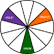
Three Secondary Colors – Orange, Green, and Violet. These colors are made by two primary colors mixed together. yellow + red = orange; yellow + blue = green; red + blue = violet

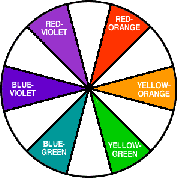
The remaining six, Intermediate Colors – Blue-Violet; Red-Violet; Red-Orange; Yellow-Orange; Yellow-Green; Blue-Green. Intermediate colors lie between the primary and secondary colors on the color wheel. Intermediate colors are made by mixing together one primary and one secondary color. Note: Intermediate colors are often mistakenly called tertiary colors but this is technically incorrect. Tertiary color is a mixture of two secondary colors. Tertiaries do not appear on the color wheel.

The color wheel shows us how colors are related and can help us understand color balance and harmony. But the color wheel, at least in its basic form, has been with us since the seventeenth century. One can’t help but wonder why such a simple and yet powerful tool goes on to be so underutilized today.
Another major source of confusion about colors are color names themselves. It is not so much that the names for colors on the color wheel that are the source of this confusion, but rather the names for the thousands of other colors that are produced by inter-mixing the main twelve and also their tints, shades or tones.
I remember a time when I was working on a color scheme with one of my clients. We were discussing her exterior wall color when I mentioned that the paint color. she was leaning toward using, would look better with her tile roof if it was a bit redder. She would not hear of it. She told me that she did not like red and wanted no part of it on her home. It was not until I showed her a sample of color that I had in mind when she agreed that it was a better choice. She was still confused though as to why I was calling red what looked to her just like your basic off-white. Yes, you could have called that color “off white”, but this name would have also applied to dozens of colors that I could produce by inter-mixing white with various combinations of no more than the three primary colors. (Actually the number of off-whites that can thus be produced is virtually limitless,)
This was just an example of confusion about color because of a lack of proper color definition. Let’s just look at some color names given by serious paint manufacturers: “Italian Iris”, “Province”, “Berry Blush”, “Loyalist”, etc. I think these were named this way to excite our imaginations. Well, perhaps all of us can use some excitement in that area. But the main reason for naming is to create a mental association to a physical object, or to an attribute of some sort. When I say the word “cat”, you may get a mental picture of a cat. When we say “yellow”, both you and I will likely be able to identify it on the color wheel.
Perhaps there is a better way to identify color than to pull names out of a hat. Let’s define a few more color terms.
Hue – The pure color with no white, black or gray added. For example, the hue of pink is red.
Value – The degree of the light reflectance of a color. The value of color is changed in proportion to the amount of white or black added to the hue. The greater the amount of white the higher the light reflectance value (LRV). Similarly, the more black the lower the value.
Note: Adding medium gray (about an even mix of white and black) to a hue will mute it (tone it down), without changing its LRV very much.
Complementary Colors lie opposite each other on the color wheel. These colors always go well with and enhance each other, hence the term complementary. When used in moderation, the use of color complement can be a very effective addition to a color scheme.
So, how does this information help us, and what does it all have to do with painting and decorating with color?
Let’s use the story of my client’s color scheme. Her roof tile was a brownish color (actually, a toned down brown). The “off white” that she had originally chosen was a high value tint of blue. The color I suggested was a tone of high value red-orange (a worm off-white). This color, basically being a tint of the roof tile color, naturally worked well in our color scheme and the client liked it.
Turquoise is a color I had no definition for until I visited Cancun, Mexico about twenty years ago. I had heard the color name but had no mental association for “turquoise” until I saw the Caribbean Sea. It was truly one of the most beautiful things I had ever seen. This sea was like a shimmering jewel with its color blending gradually from the very saturated turquoise in the distance to a very light, almost colorless, by the shore. But how would you describe this color to someone who doesn’t have a mental association for it? Well, if this person had some knowledge of color basics, you could tell them that a light turquoise is a tint of blue-green.
This color definition, incidentally, would also be very useful in application of the color wheel to decorating. Let’s say you had a beautiful painting with the scenery of Caribbean Sea you wanted to showcase. You could paint the wall, that this painting will be hanging on, a light tint of red-orange and watch the color of the sea in your painting really come alive. This again is because red-orange is a complement to the blue-green.
In the above two examples we used monochromatic and complementary color techniques. There are more techniques to be used in color scheme building, but perhaps this is a topic of another discussion. Here, I just wanted to clear up some color basics and introduce the color wheel as a practical tool.
I hope this helps!
Also read Color Scheme Building.
Yefim Skomorovsky
Painting Contractor in San Francisco Bay Area


