Classic Shades Painting
Great looking, long-lasting paint job. Guaranteed !℠
Do You Have A Painting Project We Can Help With?
Color Scheme Building
Once you have some understanding of color basics and have an idea as to why we refer to the color wheel as a color tool, we can take a closer look at a practical application of this information, and begin to learn how to use some easy rules and techniques of color scheme building.
In decorating, rarely does it happens that we get to develop the entire color scheme from scratch. Most likely we will start-off with existing objects like drapes, rugs and furniture, that must remain in the space being decorated. Unless it is neutral, every one of these objects will exhibit a characteristic of some color. Once this color is identified, and is associated with one of the colors on the color wheel, the object’s inclusion into a color scheme can become possible.
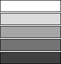
The neutrals are black, white, and gray (the complete spectrum in between white and black). Neutral, in our context, means without color. The neutrals go well with everything and clash with nothing.
Most of the rules, using the color wheel in color scheme building, are based on color complements. In general, complementary color schemes are the most popular of the color scheme patterns. Here every color is balanced by another and this makes for color schemes that are pleasing to the eye.
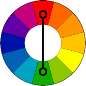
True Complement Colors are any two colors located directly across from each other on the color wheel . The true complement of green, for example, is red. For orange, it’s blue. For yellow, it’s violet. Pairing a color with its complementary color will make both colors appear more vibrant.
The true complement color scheme produces a stronger contrast than other color schemes and draws maximum attention. With this scheme, choose a dominant color and use its complementary color for accents. Because of the high contrast factor, this color scheme must be managed well so that it does not appear too jarring. Use tints, tones and shades of complementary colors to soften the look.
For example, the true complement color scheme may include: a tint, tone or shade of the dominant color; a shade of the dominant to a subdominant color; using a different value of either of the true complements for additional accent colors.
Dominant color: The color with the largest proportional area, such as main walls.
Subdominant color: The second largest color area such as wood trim, window treatments, upholstery or floor covering.
Accent colors: The color with a small relative area, like an architectural detail or a piece of intricate trim, which perhaps you would like to focus attention on. Placing small areas of light color on a dark background or a small area of dark on a light background will also create an accent. A well chosen lamp base, area rug or a plant can also provide an excellent source of a complimentary accent color for your color scheme.
A split complementary color scheme is another variation of a complementary scheme. It is similar to a true complement scheme but offers more color variety.
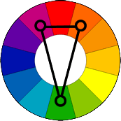
Split complement color scheme is based on three colors. It uses a color and the two colors adjacent to its true complement. The split complement is an expansion of the true complement. The difference is that split complementary colors are directly adjacent to and on both sides of the true complementary color selected. For example, if green is your main color – the true complement would be red, thus the split complementary colors to green would be red-orange and red-violet. The split complementary provides high contrast without the strong tension of the true complementary scheme.
For example, the split complementary schemes may include: a tint or shade of the dominant color selected; a shade of one of the split complementary colors; a tint or shade of the other split complement in the paint or you can use room furnishings to pick up the third color; additional use of tints of any of the tree colors selected; additional accent colors using a different value of any of the three split complementary colors.
Another type of complement scheme, in which three colors are used, is called a triad. The word “triadic” derives from the word “triad” which means three.
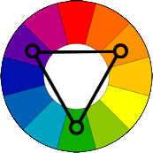
The triadic color scheme uses three colors equally spaced around the color wheel . These three colors lie inside an equal sided triangle when it is applied to the color wheel . The most common and easily identified triadic scheme uses the primary colors of red, yellow, and blue. Another example of triadic scheme is violet, orange and green and yet another example is red-purple, yellow-orange and blue-green.
The triad is one of the most useful formulas for harmony and it is often used in decorating to form pleasing color schemes. Because triads use colors that are unrelated, they can be difficult to work with. To use triadic harmony successfully, the colors should be carefully balanced – let one color dominate and use the two others for accents. If the color looks too harsh, tints and shades of a triad can be used to soften this effect of unrelated colors.
For example, triadic color schemes may include: a tint or shade of the dominant color selected; a shade of one of the triads; a tint or shade of the remaining triad in paint, or the use of room furnishings to pick up the third color; additional use of a tint or shade of any of the three colors selected; additional accent colors using a different value of any of the three triad colors.
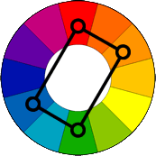
The double complementary color scheme is based on a combination of four colors. It can also be viewed as two overlapping true complements. The double complements are spaced on either side of an imaginary true complement. For example, if true complements are orange and blue then double complements would be yellow-orange and blue-violet plus green and red.
The double complement color scheme is the richest of all of the schemes because it uses four colors. This scheme can be hard to harmonize particularly if all four colors are used in equal amounts, so you should choose one color to be dominant or use tints, shades or tones of the other colors selected.
The complementary is not the only type of a color scheme. The two others, which are also based on the color wheel , are not really complements. These are the monochromatic color scheme which is based on one color, and the analogous color scheme which is based on several connecting colors.
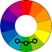
Analogous Colors (“analogous” means similar) lie immediately adjacent to each other on the color wheel , having one color in common. For example: yellow-green, green and blue-green or yellow-orange, orange and red-orange.
The analogous color scheme is easy to create but it lacks color contrast of complementary schemes. Usually analogous schemes are limited to three adjacent colors, although there could be as many as five. One color should be used as a dominant color while others are used to enrich the scheme.
Analogous schemes are natural and thus more comfortable. Because of this, they can give the appearance of seasonal effects such as yellow to green in the spring or yellow to red, gold, and brown in the fall. Such effects lead to the use of analogous schemes to give a sense of coolness or warmth where desired, such as in spaces of either too abundant or very limited amount of sunlight and their use in warm or cool climates.
For example, analogous color schemes may include: A tint of the dominant or common color; a shade of the second color; a shade or tint of the third color in the paint or its use in room furnishings; additional accent colors that can be made by using a tint or shade of either two colors not used in room furnishings.
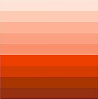
The monochromatic color scheme (“mono” meaning one and “chroma” meaning color) uses only one color as a base. Every color can have a wide variety of shades, tints and tones. The color violet, for example, can range from a deep eggplant to light lavender. Using various shades, tints and tones of a single color you can create many good looking monochromatic schemes.
The monochromatic color scheme is easy to manage, because it always looks balanced and visually appealing. Monochromatic colors, by default, go well together.
For example, the monochromatic color scheme may include: a light tint of the base color on the ceilings and trim; a tone of the base color on walls; a shade of the base color in furnishings; a bright value of the base color for an accent on a wall or a vase.
However, the use of only one color can run a risk of becoming too monotonous and it can be difficult, when using this scheme, to highlight the most important elements. Fortunately, there is no hard rule against combining color schemes so it would be perfectly acceptable to use a splash of a true complement color, perhaps for an accent, to spice up the monochromatic.
The color wheel can be divided into two categories – warm colors and cool colors.
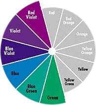
Cool colors are made mostly of green, blue and violet. They are called cool because they remind us of cool things like a cool forest, a cold lake, sky, air, or ice. Cool colors tend to be psychologically soothing and can actually make people feel cooler because they can slightly lower the blood circulation and thereby decrease body temperature.
The cool colors have a tendency to feel like they are receding (or backing away from you). These colors can make a small space appear larger. Because of this, cool colors are often used to paint the walls of a small room to make the room appear larger or airier.
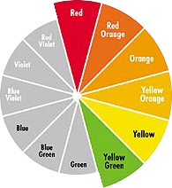
Warm colors are mostly made of red, orange and yellow. They are called warm because they remind us of warm things like the sun or fire. Warm colors tend to be more exiting and can actually make people feel warmer because they can slightly increase blood circulation and body temperature.
Warm colors tend to optically advance in space. Colors like deep red can make large spaces appear to be more intimate. A soft yellow can make a dreary room feel more cheerful and sunnier, so-to-speak.
Color is very powerful! It can stimulate your senses or it can help you relax. With color you can create a mood. A well-chosen color scheme can transform and literally add value to your home. This power of color comes from its ability to produce physiological as well as psychological reactions in people. A great power indeed!
Don’t you think it was a lucky break that, some 20,000 years ago, our forefathers (or perhaps it was our fore-mothers) come up with this notion of paint? I, for one, feel very fortunate to be in a profession where I can help create such big effects with such relative ease.
Also read More About Paint Colors – The Color Wheel.
Yefim Skomorovsky
Painting Contractor in San Francisco Bay Area


